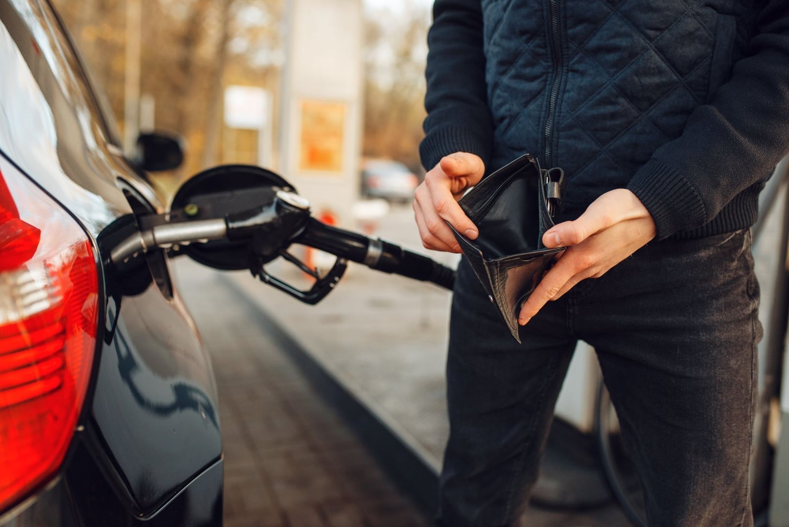
Petrol prices have been doing one thing for a while now, and it isn’t going down. So we built something that puts a number on the obvious counter-argument: every kilometre you ride is a kilometre you didn’t pay to drive.
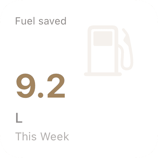
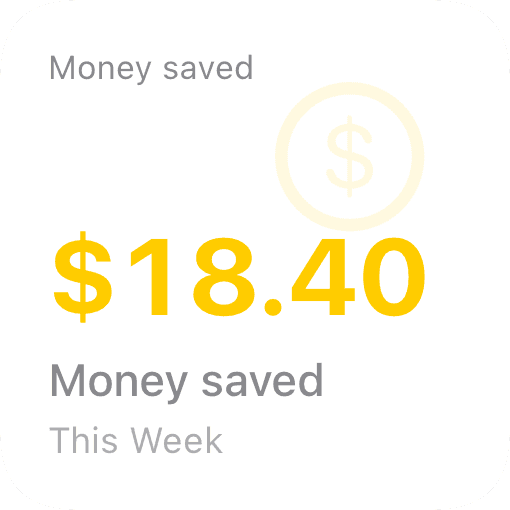
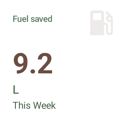
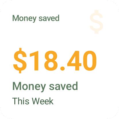
Open Party Onbici today and you’ll see two new tiles wherever we already track your distance — your dashboard, every party, every route. Fuel saved, in litres or gallons. Money saved, in your local currency.
What’s new
It’s three places, really:
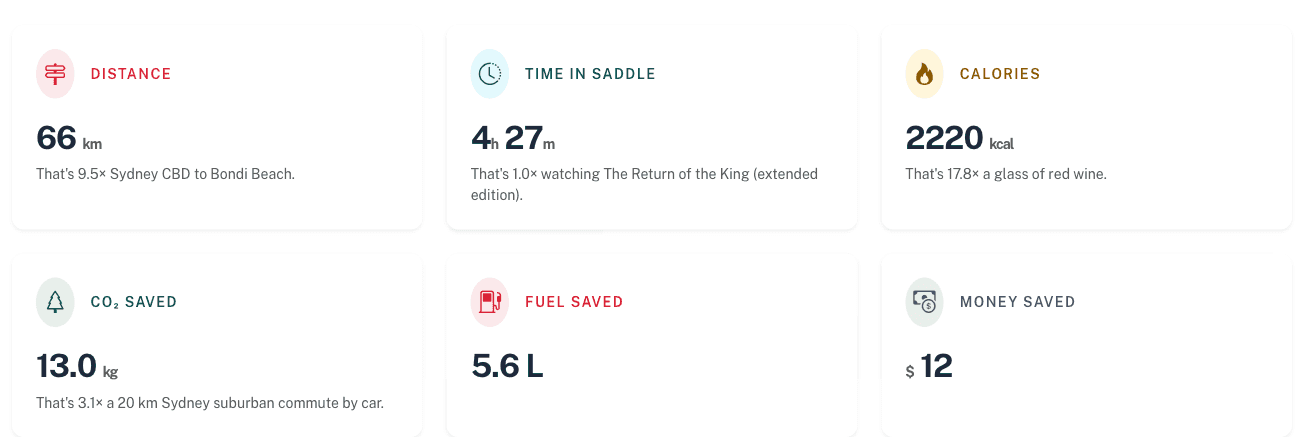
Your lifetime dashboard — the running total of every kilometre you’ve ever logged with us, now with the litres of petrol you didn’t burn and the dollars (or euros, or pounds) you didn’t spend at the pump.
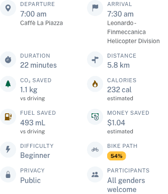
Every party — when you join a group ride, the party page shows the per-trip fuel and money each rider saved by skipping the car.
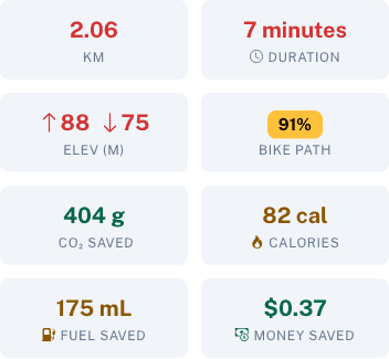
Every route — plan a trip, see exactly what that trip would cost in fuel before you even commit to it.
How we calculate it
We assume you’d otherwise have driven an average petrol car. The constants are different for each region we serve:
| Region | Fuel economy | Petrol price | CO₂ |
|---|---|---|---|
| Australia | 8.5 L/100 km | A$2.10/L | 196 g/km |
| Italy / EU | 6.5 L/100 km | €1.85/L | 150 g/km |
| United States | 9.8 L/100 km (~24 mpg) | US$0.87/L (~$3.30/gal) | 226 g/km |
So if you’re in Sydney and you ride 10 km instead of driving, that’s about 0.85 litres of petrol and A$1.80 that didn’t leave your bank account. Multiply it across a year of bike-commuting and the numbers stop being theoretical.
The numbers are deliberately conservative. Real cars idle in traffic. Real petrol runs through inefficient older engines. Real prices spike when you most need to fill up. We picked fleet averages, not best-case figures.
Home-screen widgets — iOS and Android
We’re not going to tell you to open the app every day to check. So we shipped widgets.
 |  |  |  |
| iOS — Fuel saved | iOS — Money saved | Android — Fuel saved | Android — Money saved |
Two small widgets, two platforms. Drop them on your home screen and the running tally updates in the background as you ride. There’s something quietly motivating about glancing at your phone before bed and seeing that this week’s commutes added up to a tank you didn’t have to fill.
Localised in 21 languages
Same feature, your language, your currency. The dashboard, the party page, the route view, and the widgets all flip together when you change your language preference. Numbers use local decimal separators (13,0 kg in French, 13.0 kg in English), volumes flip between litres and US gallons, and currencies show the symbol you actually recognise.
A note on what this isn’t
This isn’t an environmental halo or a guilt trip about the days you do drive. Cars are useful. Sometimes the bike isn’t the right tool. The point of these tiles is much smaller and much more practical: most of the rides you’re already doing have a real, countable economic value attached to them, and you should know what it is.
If you’ve been riding for years, the lifetime number on your dashboard is probably going to surprise you. We’ve had internal testers come back with reactions ranging from “huh” to “wait, how much?”.
Try it now: open your dashboard (or the EU one) and scroll down to Your Riding Impact. Add the iOS or Android widget to your home screen and watch the number tick up over the next week.
Or join us on a party ride — half the fun is comparing the savings panel afterwards.